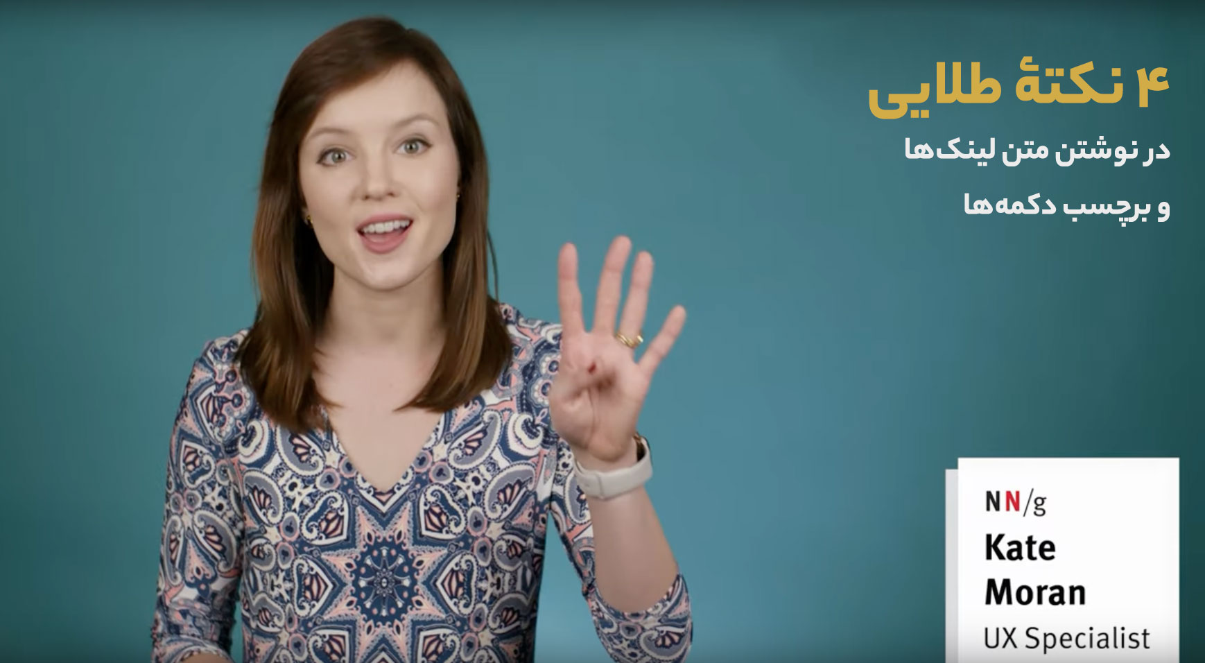
4 tips about label text – UX copy for buttons and links

A lot of detail comes out of the corners of a user experience. We get more detailed as we dig deeper into the product. Testing and interviews reveal details that were previously hidden like birds in foggy weather. One of the details that have a lot of power is the label text and UX copy of the buttons and links. It can mean billions of dollars of profit or loss.
UX copy for buttons and links is a bit challenging. In this video, UX expert Kate Moran points out 4 golden rules.
You can read the text if you’re bored, or watch the video if you’d rather.
How to write label text: UX copy for buttons and links
When designing text for buttons or links, we need to take four things into account so that the user can easily find it in the navigation process, understand its meaning, and find what they’re looking for.
Specific: Tell me what’s going on
We should choose simple links or tags for the buttons. Any type of non-transparency in this regard is unacceptable.
User experience copy should explain what happens after the user clicks a link (or button). Keep it simple and straightforward.
it’d be better to be a little less clever but more straightforward.
Kate Moran
The phrases like “Learn more”, “More information”, “More details” etc. are all very common. What does “more detail” actually mean? Tell me about it. Why would this be useful to me?
According to Kate Moran, giving more details to these words will make the experience better. For example: “Learn more about getting a loan” or “Learn more about a loan”. Was it long? You’ll see what Kate Moran has to say about it.
Sincere: Links are like promises
As Moran says, label text of links are like promises, so there has to be a balance between what they promise and what they deliver. She gives this example:
For example, a participant on a travel site found a tour that she wanted to book.
Kate Moran
She saw a link with the label, “More Info & Book.”
So, she clicked it. But then she was annoyed to find that instead of taking her to book the tour, she received a pop-up with a contact form.
Not what she was expecting.
That label could have been improved by being just a little
more transparent about the next step of the process.
For example, “Contact Us to Book.”
Substantial: I’m scan
Research shows people pay close attention to salient elements when browsing UI pages, says Kate Moran. Different-looking links grab their attention. Let’s make links pop.
Succinct: Be content and useful
In UX Writing, everyone’s talking about shorthand. Likewise, Kate Moran defends sufficient talking and says: Quickly get to the point so the user notices the function of the link while browsing the page and finds what he is looking for.
Nonetheless, she says shorthand is the last of the four golden principles, which means it’s useless if it violates the three principles before it.
Concision is important, but it has to be balanced with the other three priorities in link label-writing.
Kate Moran
There’s no maximum word count for links. They can be as long as they need to be to. achieve those other three priorities.
But! No longer than that.
Each word included in the link should support those goals.
Keep in mind these four priorities the next time that you write a link label.


